

You’ll process the visual of this blog post 60,000 times faster than you'll read the first line. That’s not just an interesting statistic, it’s a fundamental truth about how the human brain is wired for survival and decision-making.
In a fast-paced world where attention spans are shrinking and choices are endless, your audience isn’t giving your content a fair, leisurely evaluation. They are skimming, scrolling, and deciding in seconds whether your message is worth their time.
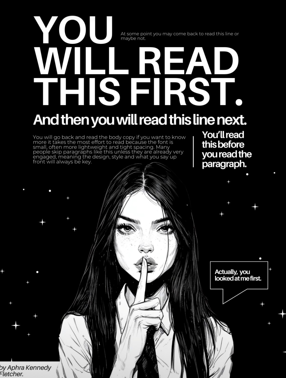
Thanks to visual artist Aphra Kennedy Fletcher for capturing this reality so powerfully in an artwork recently shared by strategist Nehal Kazim.
Their point is clear: in today’s digital landscape, the visual isn’t just supporting the story — it is the story.
First impressions happen faster than you think
We often hear brands say:
It’s an understandable sentiment; most of us were taught to prioritize substance over style.
But here’s the problem: If no one notices your content, they’ll never experience the substance you've worked so hard to create.
In a scroll-driven world, where the first impression happens in under 1.7 seconds, visuals are your first handshake, your opening line, your first and possibly only chance to connect.
What happens when design is an afterthought
When visuals are treated as "nice to have," campaigns suffer. Here’s how:
Conversely, when visual strategy is intentional, when colors, layouts, and visual cues are chosen deliberately to complement the message, the impact is multiplied.
Performance doesn’t just improve — it compounds over time.
How Purpose approaches visual strategy
At Purpose Communications, we believe great visual strategy is less about making things "pretty" and more about making them clear, emotional, and accessible.
Here’s the framework we apply when building content:
Even when campaigns are meant to feel raw, spontaneous, or "low-fi," the visual choices behind them are deliberate. Authenticity doesn’t mean randomness. It means the form matches the function.
Practical example: The power of visual-first thinking
Consider two social media ads for the same product.
Both have strong copywriting, but only one uses a bold, emotionally resonant image with clear hierarchy and effective use of whitespace.
Guess which one gets more clicks, better engagement, and higher conversion rates?
Visual-first thinking isn’t just for Meta ads or Instagram posts. It applies to:
In every case, the visual doorway determines whether your audience steps inside.
The bottom line
In today’s communication environment, great content doesn't win attention. It earns attention through great design first. The most innovative brands understand this. They invest in visual storytelling not because it's "trendy," but because it's how humans are hardwired to respond.
At Purpose Communications, we help brands align their visual language with their messaging, creating content that is seen, felt, remembered, and acted upon.
Because in a scroll-based world, being noticed is no longer a luxury. It’s the starting point.
Share